the world is ours.
new logo
Creative Direction
Art Director
Project Manager
Brand Identity
Designer
overview
“What is DubyaWorld.? : A community connected virtually then personally”. - Jacob Wade, Founder
Dubya.World was seeking an identifiable mark which indicated technology, connection and systems all while being legible primarily in the digital space. The identity should reference the values of the brand and be an instant indicator to someone visually about what the company may be about, all while keeping in mind this is a parent company that would have subsidiaries in the future added to their family.
approach
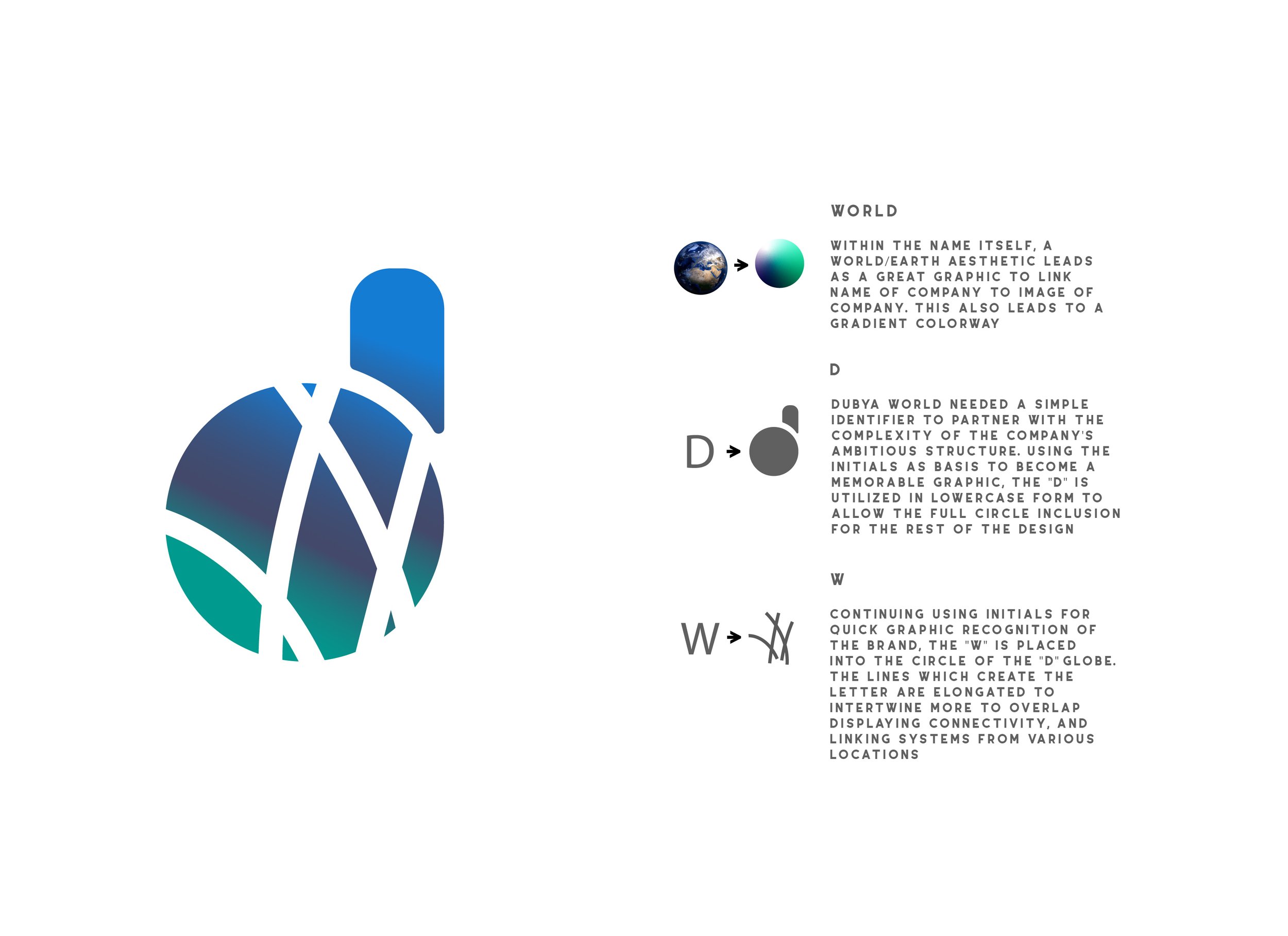
Creating a “world” of connections, systems and processes remained as prioritized goals throughout the collaboration procedure. The imagery of a recognizable planet/world such as earth is used to evoke familiarity with a space people would want to be a part of. As the brand serves as a parent company for current and future subsidiaries, the “world” this venture creates was too evident to ignore in the logo creation.
Principles of the brand constructed around alliteration such as “We, Work, Win” influenced the idea of featuring the initial letters of both words within the design. Those letters were visualized through intertwining and linking across a globe like image to signify places, people, ideas, and elements coming together.